
tech blog

Code. Create. Commit. Welcome to dev/core

What does it mean to be a developer? That question was at the heart of our thinking behind the new GitHub Shop collection: dev/core. The collection celebrates the developer’s layered experience—from the code, through the world of creation, to the unique identity of you, the developer, the builder, the person at the core of it all.  Ok, that sounds poetic, we hear you say. But how does that translate into merch? Our dev/core collection captures what it is to be a developer but also brings an exciting update to our core basics. Made by developers, for developers. Let’s dive into it.  A developer from head to toe The <header> cap and <footer> socks are for those who know their way around a codebase—and an outfit. The cap kicks things off, a nod to the top of every great project. Down below, the socks wrap things up with comfort. Together, they bookend your look the way you bookend your code. Getting back to the basics Inspired by the all-time favorite black Invertocat hoodie, these two new builds level up your dev uniform. One features our iconic Octocat mascot reimagined in ASCII. The other reps GitHub Copilot, your favorite AI pair programmer. One nods to our roots as developers. The other looks to what’s next. For when your brain hits Ctrl+Alt+Vibes Throw it back to your first build—when the code was janky, the caffeine was flowing, and the dream was big. This tie-dye tee channels that raw, colorful chaos that got you into being a dev in the first place. It’s got startup energy. Garage band energy. “I learned CSS on a forum in 2004” energy. The graph you obsess over (now in tote form) There’s something deeply satisfying about watching your contribution graph fill up day by day, square by square, with every commit and small (or large) breakthrough. This tote celebrates that love with a contribution graph in the shape of our Invertocat, worn proudly on your side.  Write code, wear code The ASCII tee is a tribute to the early days of building—when text was all you had and all you needed. It’s a direct tribute to the roots of development—where every line of code is a building block. Look familiar? You might recognize it from thegithubshop.com homepage, where we’ve created your very own interactable version. You can spin it, shake it, fidget with it— perfect for when your stand-up is getting a little dull.  Made for developers, by developers Developers are at the heart of what we do, because they’re the core of who we are. Our shop isn’t just a shop. It’s also chock-full of fun developer finds, and we’re not just talking about the swag now. We’ve even added a hidden CLI: type git [space] into the search bar. Have fun! In our dev/core collection, you can mix and match to create new patterns on our images by tapping on the dev/core pill. This unlocks a tool palette to customize the ASCII pattern, size, and speed. The dev/core collection is more than merch—it’s a wearable nod to the builders, the dreamers, and the committers who shape the internet every day. From the clean lines of ASCII art to the playful and colorful additions, each piece is carefully designed for you. So whether you’re pushing code, sipping coffee, or staring into the abyss of your terminal, suit up in something that gets it. This is your core.  🤫 Psst… use the code “GITHUBBLOG15” at checkout to get free shipping from today until June 1. Your laptop’s looking a bit bare, btw. We’ve dropped a few new stickers in the mix too—just saying. Check out the dev/core collection at thegithubshop.com.  The post Code. Create. Commit. Welcome to dev/core appeared first on The GitHub Blog. ​ Company news, News & insights, GitHub Shop The GitHub Blog
tech blog

Real‑world video demo: Using different AI models in GitHub Copilot

Claude 3.7 Sonnet, Gemini 2.5 Pro, GPT-4… developer choice is key to GitHub Copilot, and that’s especially true when it comes to picking your frontier model of choice.  But with so many frontier generative AI models now available to use with GitHub Copilot (and more coming seemingly every day), how do you pick the right one for the job—especially with the growing capabilities of Copilot Chat, edit, ask, and agent modes? In a recent video, I worked with GitHub’s Developer Advocate Kedasha Kerr (aka @ladykerr) to answer this exact question. Our goal? To build the same travel‑reservation app three different ways with Copilot ask, edit, and agent modes while swapping between Copilot’s growing roster of foundation models to compare each AI model in real-world development workflows.  We set out to build a very simple travel‑reservation web app (think “browse hotel rooms, pick dates, book a room”). To keep the demo snappy, we chose a lightweight stack: Backend: Flask REST API Frontend: Vue.js, styled with Tailwind Data: a local  data.json file instead of a real database That gave us just enough surface area to compare models while scaffolding the app, wiring up endpoints, and adding tests, docs, and security tweaks along the way .  Here are a few key takeaways from our video (which you should watch).  But first, let’s talk about Copilot’s three modes GitHub Copilot gives you three distinct “modes:” ask, edit, and agent mode.  Ask is there to answer questions, edit is a precise code‑rewriting scalpel, and agent mode can drive an entire task from your prompt to the finished commit. Think of it this way: Ask answers, edit assists, agent executes.  What it does (nuts & bolts) Ideal moments to reach for it Ask mode Analyzes the code you highlight (or the context of your open file) and returns explanations, examples, or quick fixes without touching your code. No diffs, and no saving. It’s just conversational answers. • Debug a puzzling stack trace• Refresh your memory on a library or pattern• Grab a snippet or algorithm on the fly Edit mode You select one or more files, describe a change in a plain-language prompt, and Copilot applies inline edits across those files. But first, it shows you a diff, so you can approve every change. • Add error handling or refactor repetitive code• Tight, multi‑file tweaks in a brown‑field codebase• Apply team style rules via custom instructions Agent mode Feed it a high‑level prompt and Copilot plans steps, runs terminal commands, edits multiple files, and keeps iterating autonomously while surfacing risky commands for review. Great for project‑wide, multi‑step work. • Scaffold a new service or feature from a README• Large bug fixes that touch many modules• Automated clean ups (e.g., migrate to Tailwind everywhere) Learn more about ask, edit, and agent mode Tip 1: No matter what model you use, context matters more than you think The model you use is far from the only variable, and the context you offer your model of choice is often one of the most important elements.  That means the way you shape your prompt—and the context you provide Copilot with your prompt and additional files—makes a big difference in output quality. By toggling between capabilities, such as Copilot agent or edit mode, and switching models mid-session, we explored how Copilot responds when fed just the right amount of detail—or when asked to think a few steps ahead. Our demo underscores that different modes impact results, and thoughtful prompting can dramatically change a model’s behavior (especially in complex or ambiguous coding tasks).  The takeaway: If you’re not shaping your prompts and context deliberately, you’re probably leaving performance on the table. For a deeper dive into model choice, the guide “Which AI model should I use with GitHub Copilot?” offers a comprehensive breakdown. Tip 2: Copilot agent mode is a powerful tool Agent mode, which is still relatively new and evolving fast, allows Copilot to operate more autonomously by navigating files, making changes, and performing repository-wide tasks with minimal hand holding.  This mode opens up new workflow possibilities (especially for repetitive or large-scale changes). But it also demands a different kind of trust and supervision. Seeing it in action helps demystify where it fits in your workflows. Here are two ways we used agent mode in our demo:  One‑click project scaffolding: Kedasha highlighted the project README and simply told Copilot “implement this.” Agent mode (running Gemini 2.5 Pro) created the entire Flask and Vue repository with directories, boiler‑plate code, unit tests, and even seeded data.  End‑to‑end technical docs: I started using agent mode with Claude 3.5 and prompted: “Make documentation for this app … include workflow diagrams in Mermaid.” Copilot generated a polished README, API reference, and two Mermaid sequence/flow diagrams, then opened a preview so I could render the charts before committing . Tip 3: Use custom instructions to set your ground rules Another insight from the session is just how much mileage you can get from customizing Copilot’s behavior with custom instructions.  If you don’t know, custom instructions let you lay down the rules before Copilot suggests anything (like how APIs need to be called, naming conventions, and style standards).  Kedasha in particular underscored how custom instructions can tailor tone, code style, and task focus to fit your workflow—or your team’s.  One example? Using custom instructions to give every model the same ground rules, so swaps between each model produced consistent, secure code without re‑explaining standards each time. Whether you’re nudging Copilot to avoid over-explaining, stick to a certain stack, or adopt a consistent commenting voice, the customization options are more powerful than most people realize. If you haven’t personalized Copilot yet, try custom instructions (and check out our Docs on them to get started). Tip 4: The balance between speed vs. output quality No matter what model you use, there are always tradeoffs between responsiveness, completeness, and confidence. A larger model may not provide quick suggestions when you’re working through an edit, for instance—but a smaller model may not offer the best refactoring suggestions, even if it’s faster in practice.  TL;DR: It’s not about chasing the “best” model—it’s

tech blog

GitHub for Beginners: Building a React App with GitHub Copilot

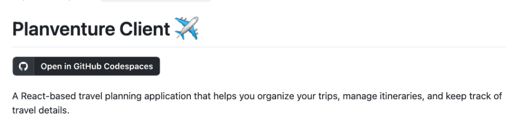
Welcome to the next episode in our GitHub for Beginners series, where we’re diving into the world of GitHub Copilot. This is our sixth episode, and we’ve  covered quite a lot of ground. You can check out all our previous episodes on our blog or as videos. Today we’re going to use GitHub Copilot to help us build a frontend project using React. In the previous episode, we created a backend API for the travel itinerary builder, Planventure. We’ll continue that work and create a React client that leverages our API to interact with Planventure. To see a full description of what we’ll be building, go to this repository and switch to the client-start branch to get started. For the demos in this series, we’re using GitHub Copilot in Visual Studio Code. Copilot is available in other IDEs, but the available functionality may vary depending on your environment. content. What you’ll need Before we get started, here’s what you’ll need:  A code editor like VS Code The latest version of Node.js  A package manager like npm Access to GitHub Copilot — sign up for free!  Alternatively, you can use a GitHub Codespace to build in the cloud—you’ll still need Copilot access if you’re using a codespace. You can click the Open in GitHub Codespaces button in the repo. What we’re building We’re creating a frontend app that connects to the backend API we created in the previous episode. We’ll be using the React library, so it’s recommended that you’re familiar with using React to build client side applications. More specifically, we’ll be using: React with Vite for the client. Material UI as the component library. Our goal is to build a working frontend app that has the following features: Authenticate users Add protected routes Add trips and itinerary information Edit existing itineraries Let’s get started! Resolving errors Since Copilot is a generative AI assistant, you might get different results even when sending the same prompt multiple times. Because of this, it’s impossible to predict when you might receive errors or what those errors will be. If an error does appear at any point in this process, use Copilot Chat to help you debug and address the error. To do this, copy the error message, open Copilot Chat, enter @workspace /fix, and then paste the error message. Copilot will then attempt to find a suggested solution to your error. Review the suggested changes, and then try again. Step 1: Initial setup Before we get started, we need to create the appropriate working environment. Clone the Planventure repository by opening your terminal in your code editor and running the following command. git clone https://github.com/github-samples/planventure Navigate to the planventure-client directory and switch to the client-start branch. cd planventure-client git switch client-start Install necessary dependencies. npm install Start the server. npm run dev Open a browser to http://localhost:5173 to verify the app is running. Become familiar with the code by examining the existing files. Note that some basic components have already been installed and configured. Open Copilot Chat and send it the following prompt to get a basic summary of the existing code: @workspace Tell me about the configuration setup in the react app. Now that the initial setup is complete, take a look at the GitHub issue to read detailed information about what we need to build. Step 2: Create login and registration forms The first thing we need to add is authentication. We’ll do this by building login and registration forms. But first, we need to create an AuthLayout component to use for all authenticated routes. Open Copilot Chat and use the model selector to select the Claude Sonnet 3.5 model. Send Copilot the following prompt. @workspace Create AuthLayout component with navigation and centered content. Hover over the proposed solution, click …, and then select Insert into New File. Review the added code and save the file. You should always review the code provided by Copilot so that you understand what it is doing and make sure it addresses your prompt. Now that we’ve created the AuthLayout component, it’s time to build a login form to implement it. Send the following prompt to Copilot Chat. @workspace Build a LoginForm component with email/password fields and validation. Create a new folder named auth under the src/components folder. Navigate back to Copilot Chat, hover over the proposed solution, click …, and then select Insert into New File. Review the added code and save the file in the auth folder. Return to Copilot Chat and choose Edits from the dropdown. Use the Add Files button to add the following files if they are not already listed in the working set: AuthLayout.jsx LoginForm.jsx Routes.jsx Send Copilot Edits the following prompt. Create a new loginPage. Update route and authLayout as needed. Review and accept all the changes from Copilot Edits. Don’t forget to save your files. Send the following prompt to Copilot Edits to update the Home component. Update the navbar to use the new loginpage and add a get started button to the home page that routes to the login page. Review the code and make any necessary changes. Then save all of the updated files.  Navigate back to the browser page and refresh it to see the latest changes.  Commit your changes to the repository. You can use Copilot to automatically generate a commit message by clicking the sparkle button in the top-right corner of the commit message box. Now we have a Get started button on the UI and the login page. Next we need to create a sign up page so that new users can register. Open up Copilot Chat and send it the following prompt. @workspace Create SignupForm component matching the login form style and a new SignUpPage. Be sure to update routing. Hover over the proposed solution to add a SignupForm component in the auth folder, click …, and then select Insert into New File. Hover over the proposed solution to add a SignupPage component in the pages folder, click …,

tech blog

Documentation done right: A developer’s guide

With all the work involved in creating and maintaining a project, sometimes writing documentation can slip through the cracks. However, good docs are a huge asset to any project. Consider the benefits: Better collaboration: Clear, consistent documentation ensures everyone’s on the same page, from your immediate team to outside stakeholders. Additionally, docs promote independent problem solving, saving core contributors the time and effort of answering every question. Smoother onboarding: By providing ways to get started, explaining core concepts, and including tutorial-style content, good documentation allows new team members to ramp up quickly. Increased adoption: The easier it is to understand, set up, and run your project, the more likely someone will use it. With these benefits in mind, let’s take a look at some important principles of documentation, then dive into how you can quickly create effective docs for your project. Key tenets of documentation There are three key principles you should follow as you document your project. Keep it clear Use plain language that’s easy to understand. The goal is to make your documentation as accessible as possible. A good guideline is to ask yourself if there are any acronyms or technical terms in your documentation that some folks in your target audience won’t understand. If that’s the case, either swap them for simpler language, or make sure they’re defined in your document. Keep it concise Document only necessary information. Trying to cover every possible edge case will overwhelm your readers. Instead, write docs that help the vast majority of readers get started, understand core concepts, and use your project. Additionally, keep each document focused on a particular topic or task. If you find yourself including information that isn’t strictly necessary, move it into separate, smaller documents and link to them when it’s helpful. Keep it structured Consider the structure of each document as you write it to make sure it is easy to scan and understand: Put the most important information first to help readers quickly understand if a document is relevant to them. Use headings and a table of contents to tell your readers where to find specific information. We suggest using documentation templates with common headings to quickly and consistently create structured content. Use text highlighting like boldface and formatting elements like bulleted lists to help readers scan content. Aim for 10% or less text highlighting to make sure emphasized text stands out. Be consistent with your styling. For example, if you put important terminology in bold in one document, do the same in your other content. Organizing your documentation Just as there are principles to follow when writing individual documents, you should also follow a framework for organizing documents in your repo.  There are many approaches to organizing documentation in your repo, but one that we’ve used for several projects and recommend is the Diátaxis framework. This is a systematic approach to organizing all the documents relevant to your project.  Applying a systematic approach to documenting your repositories can make it easier for users to know where to go to find the information that they need. This reduces frustration and gets folks contributing to your project faster.  Diátaxis divides documents based on their purpose into four categories:  Tutorials: Learning-oriented documents How-to guides: Goal-oriented instructions for specific tasks Explanation: Discussions providing understanding of the project Reference: Technical specifications and information Each document in your repository should fit into one of these categories. This helps users quickly find the appropriate resource for their current situation, whether they need to learn a new concept, solve a specific problem, understand underlying principles, or look up technical details. This can also be a helpful guide to identify which documentation your repository is missing. Is there a tool your repository uses that doesn’t have a reference document? Are there enough tutorials for contributors to get started with your repository? Are there how-to guides to explain some of the common tasks that need to be accomplished within your repository?  Organizing your documentation according to this framework helps ensure you’re taking a holistic approach to building and maintaining key content for your project. Documenting your project Want to test out this framework and guidelines for yourself? Check out this example repository with a docs folder structure and documentation templates that you can copy into your own project. The post Documentation done right: A developer’s guide appeared first on The GitHub Blog. ​ Developer skills The GitHub Blog

tech blog

GitHub Issues search now supports nested queries and boolean operators: Here’s how we (re)built it

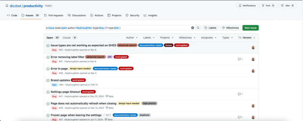
Originally, Issues search was limited by a simple, flat structure of queries. But with advanced search syntax, you can now construct searches using logical AND/OR operators and nested parentheses, pinpointing the exact set of issues you care about. Building this feature presented significant challenges: ensuring backward compatibility with existing searches, maintaining performance under high query volume, and crafting a user-friendly experience for nested searches. We’re excited to take you behind the scenes to share how we took this long-requested feature from idea to production. Here’s what you can do with the new syntax and how it works behind the scenes Issues search now supports building queries with logical AND/OR operators across all fields, with the ability to nest query terms. For example is:issue state:open author:rileybroughten (type:Bug OR type:Epic) finds all issues that are open AND were authored by rileybroughten AND are either of type bug or epic. How did we get here? Previously, as mentioned, Issues search only supported a flat list of query fields and terms, which were implicitly joined by a logical AND. For example, the query assignee:@me label:support new-project translated to “give me all issues that are assigned to me AND have the label support AND contain the text new-project.” But the developer community has been asking for more flexibility in issue search, repeatedly, for nearly a decade now. They wanted to be able to find all issues that had either the label support or the label question, using the query label:support OR label:question. So, we shipped an enhancement towards this request in 2021, when we enabled an OR style search using a comma-separated list of values. However, they still wanted the flexibility to search this way across all issue fields, and not just the labels field. So we got to work.  Technical architecture and implementation From an architectural perspective, we swapped out the existing search module for Issues (IssuesQuery), with a new search module (ConditionalIssuesQuery), that was capable of handling nested queries while continuing to support existing query formats. This involved rewriting IssueQuery, the search module that parsed query strings and mapped them into Elasticsearch queries. To build a new search module, we first needed to understand the existing search module, and how a single search query flowed through the system. At a high level, when a user performs a search, there are three stages in its execution: Parse: Breaking the user input string into a structure that is easier to process (like a list or a tree) Query: Transforming the parsed structure into an Elasticsearch query document, and making a query against Elasticsearch. Normalize: Mapping the results obtained from Elasticsearch (JSON) into Ruby objects for easy access and pruning the results to remove records that had since been removed from the database. Each stage presented its own challenges, which we’ll explore in more detail below. The Normalize step remained unchanged during the re-write, so we won’t dive into that one. Parse stage The user input string (the search phrase) is first parsed into an intermediate structure. The search phrase could include: Query terms: The relevant words the user is trying to find more information about (ex: “models”) Search filters: These restrict the set of returned search documents based on some criteria (ex: “assignee:Deborah-Digges”)  Example search phrase:  Find all issues assigned to me that contain the word “codespaces”: is:issue assignee:@me codespaces Find all issues with the label documentation that are assigned to me: assignee:@me label:documentation The old parsing method: flat list When only flat, simple queries were supported, it was sufficient to parse the user’s search string into a list of search terms and filters, which would then be passed along to the next stage of the search process. The new parsing method: abstract syntax tree As nested queries may be recursive, parsing the search string into a list was no longer sufficient. We changed this component to parse the user’s search string into an Abstract Syntax Tree (AST) using the parsing library parslet. We defined a grammar (a PEG or Parsing Expression Grammar) to represent the structure of a search string. The grammar supports both the existing query syntax and the new nested query syntax, to allow for backward compatibility. A simplified grammar for a boolean expression described by a PEG grammar for the parslet parser is shown below: class Parser < Parslet::Parser rule(:space) { match[” “].repeat(1) } rule(:space?) { space.maybe } rule(:lparen) { str(“(“) >> space? } rule(:rparen) { str(“)”) >> space? } rule(:and_operator) { str(“and”) >> space? } rule(:or_operator) { str(“or”) >> space? } rule(:var) { str(“var”) >> match[“0-9”].repeat(1).as(:var) >> space? } # The primary rule deals with parentheses. rule(:primary) { lparen >> or_operation >> rparen | var } # Note that following rules are both right-recursive. rule(:and_operation) { (primary.as(:left) >> and_operator >> and_operation.as(:right)).as(:and) | primary } rule(:or_operation) { (and_operation.as(:left) >> or_operator >> or_operation.as(:right)).as(:or) | and_operation } # We start at the lowest precedence rule. root(:or_operation) end For example, this user search string:is:issue AND (author:deborah-digges OR author:monalisa ) would be parsed into the following AST: { “root”: { “and”: { “left”: { “filter_term”: { “attribute”: “is”, “value”: [ { “filter_value”: “issue” } ] } }, “right”: { “or”: { “left”: { “filter_term”: { “attribute”: “author”, “value”: [ { “filter_value”: “deborah-digges” } ] } }, “right”: { “filter_term”: { “attribute”: “author”, “value”: [ { “filter_value”: “monalisa” } ] } } } } } } } Query Once the query is parsed into an intermediate structure, the next steps are to: Transform this intermediate structure into a query document that Elasticsearch understands Execute the query against Elasticsearch to obtain results Executing the query in step 2 remained the same between the old and new systems, so let’s only go over the differences in building the query document below. The old query generation: linear mapping of filter terms using filter classes Each filter term (Ex: label:documentation) has a class that knows how to convert it into a snippet of an Elasticsearch query document. During query document generation, the correct class for each filter term is invoked

tech blog

GitHub Availability Report: April 2025

In April, we experienced three incidents that resulted in degraded performance across GitHub services. April 11 03:05 UTC (lasting 39 minutes) On April 11, 2025, from 03:05 UTC to 03:44 UTC, approximately 75% of Codespaces users faced create and start failures. These were caused by manual configuration changes to an internal dependency that escaped our test coverage. Our monitors and detection mechanism triggered, which helped us triage, revert the changes, and restore service health. We are working on building additional gates, safer mechanisms for testing, and rolling out such configuration changes. We expect no further disruptions.  April 23 07:00 UTC (lasting 20 minutes) On April 23, 2025, between 07:00 UTC and 07:20 UTC, multiple GitHub services experienced degradation caused by resource contention on database hosts. The resulting error rates, which ranged from 2–5% of total requests, led to intermittent service disruption for users. The issue was triggered by an interaction between query load and ongoing schema change that led to connection saturation. The incident recovered after the schema migration was completed. Our prior investments in monitoring and improved playbooks helped us effectively organize our first responder teams, leading to faster triaging of the incident. We have also identified a regression in our schema change tooling that led to increased resource utilization during schema and reverted to a previous stable version.  To prevent similar issues in the future, we are reviewing the capacity of the database, improving monitoring and alerting systems, and implementing safeguards to reduce time to detection and mitigation.  April 23 19:13 UTC (lasting 42 minutes) On April 23, 2025, between 19:13:50 UTC and 22:11:00 UTC, GitHub’s Migration service experienced elevated failures caused by a configuration change that removed access for repository migration workers. During this time, 837 migrations across 57 organizations were affected. Impacted migrations required a retry after the log message “Git source migration failed. Error message: An error occurred. Please contact support for further assistance.” was displayed. Once access was restored, normal operations resumed without further interruption. As a result of this incident, we have implemented enhanced test coverage and refined monitoring thresholds to help prevent similar disruptions in the future. Please follow our status page for real-time updates on status changes and post-incident recaps. To learn more about what we’re working on, check out the GitHub Engineering Blog. The post GitHub Availability Report: April 2025 appeared first on The GitHub Blog. ​ Company news, News & insights, GitHub Availability Report The GitHub Blog

tech blog

Our pledge to help improve the accessibility of open source software at scale

GitHub is honored to take the Global Accessibility Awareness Day (GAAD) Pledge, reaffirming our commitment to improving accessibility in open source software. Through our work, our aim is to empower people with disabilities to contribute to open source, increase the availability of open source Assistive Technologies, and enhance the accessibility of mainstream open source projects.  Joe Devon initially proposed the idea for GAAD in a 2011 blog post because he was frustrated by the lack of information about accessibility for developers. With the help of accessibility advocate Jennison Asuncion, Joe’s proposal led to the first GAAD in May 2012, which has since evolved into an annual global event that reaches millions of people. In 2020, the GAAD Foundation launched the GAAD Pledge to incorporate accessibility into the core of open source projects, and now, GitHub is proud to join this important initiative. Our pledge Our pledge will focus on the following interdependent goals: Empower people with disabilities to contribute to open source Increase the availability and adoption of open source assistive technologies  Increase the accessibility of mainstream open source projects  Read on for how we plan on executing these goals: Empower people with disabilities to contribute to open source Given that technology is a ubiquitous and essential part of modern life, and approximately 16% of the human population, or 1.3 billion people, have a disability, it is critical that people with disabilities are able to contribute to the development of the technology that is used by all of humanity. When people with disabilities contribute, we increase the probability that the resulting technologies will be usable by everyone.  For example, consider the story of Becky Tyler. Becky is a bright, engaging, and tenacious young woman with quadriplegic cerebral palsy who interacts with her computer exclusively by using her eyes. Becky started off simply wanting to play Minecraft, but accessibility barriers led her down a path beyond mining ore and into the world of open source software where she began learning to code. She now attends the University of Dundee, where she studies Applied Computing. We need to build more inclusive open source communities that better represent the rich diversity of humanity. In order for everyone to contribute, we need to remove barriers that block people with disabilities from development platforms and tools. Those barriers include a a lack of keyboard operability, insufficient color contrast, and incompatibility with assistive technologies such as screen readers.  Removing accessibility barriers will enable every developer to keep exercising their craft.  Increase the availability and adoption of free and open source Assistive Technologies  Many people with disabilities require Assistive Technology to access a computer or perform the basic functions of daily living. According to the Assistive Technology Industry Association, assistive technology is, “any item, piece of equipment, software program, or product system that is used to increase, maintain, or improve the functional capabilities of persons with disabilities.”  The challenge is that proprietary Assistive Technology products can be very expensive. That challenge is exacerbated by the fact that people with disabilities are less likely to be employed and less likely to have earned an advanced degree, according to the U.S. Bureau of Labor Statistics. On GitHub, anyone can create assistive technologies that improve access for people with disabilities. There are no financial or bureaucratic hurdles. In addition, open source licenses allow anyone to use those assistive technologies. They also enable like-minded individuals to form communities that support and improve the assistive technologies.   For example, Jamie Teh and Michael “Mick” Curran  created the NVDA screen reader, a free, high-quality screen reader for the Microsoft Windows operating system. Over the past 15 years, they have built a community that includes hundreds of blind developers and contributors, as well as more than 250,000 users. We need more free and open source assistive technologies like NVDA. We also need to increase the awareness of those alternatives within both the global community of people with disabilities and people who support them, such as care-givers, occupational therapists, speech therapists, and other forms of assistive technology and rehabilitation professionals.  Increase the accessibility of mainstream open source projects  The world runs on open source software. For example, ninety percent of companies use open source1, 97% of codebases contain open source2, 70-90% of the code within commercial tools comes from open source3, and the value of OSS globally is estimated to be $8.8 trillion4. It is absolutely essential that computing infrastructure, frameworks, and libraries are designed with accessibility in mind so downstream consumers of those projects can also access them. Investment in upstream open source projects not only makes it possible for consuming applications to be accessible, those investments can make an exponential impact on the accessibility of downstream projects. On the other hand, if accessibility is not embedded in upstream projects, it can be impossible or very expensive for downstream projects to support accessibility. There are additional benefits beyond the accessibility of the projects themselves. Popular open source projects set trends for the entire software industry. When those communities include accessibility as a core requirement, they raise expectations and educate developers across the industry. We need to increase the accessibility of mainstream open source projects from three perspectives: End users: so end users with disabilities can use applications and content that is built with open source software. Consumers: so developers and Information Technology (IT) professionals with disabilities can access the documentation, videos, and enablement materials that are required to consume open source projects and build on them. Contributors: so developers and other types of contributors with disabilities can join open source communities, contribute, and enjoy the benefits of learning and sharing with a like-minded group of creators. Our strategy  We recognize that these goals are never “done.” By definition, technology evolves constantly and, as a result, we consider accessibility to be an on-going practice as much as a task that can be completed. We will use the following strategies to steward progress towards the goals going forward: Improve our platform Build partnerships  Support open source

tech blog

Telecom’s Future Success Starts with a Strategy

Learn how Dell Technologies Advisory Services lays the groundwork for the Open Telecom Transformation Program.   ​  ​Learn how Dell Technologies Advisory Services lays the groundwork for the Open Telecom Transformation Program. Telecommunications Blog | Dell

tech blog

Dos and don’ts when sunsetting open source projects

Maintaining an open source project can be a big responsibility. But it’s not one you’re obligated to bear forever. Maybe usage has declined thanks to a better solution. Maybe technology has evolved to the point that it’s easier to start over with a new project than adapt an old project to a new ecosystem. Sometimes it’s time to move on, even if that means deprecating a project. Brett Terpstra, a front-end developer, maintains more than 100 GitHub repositories and has had to retire more than a few. “Projects that rely on APIs and other outside applications often require more work than is worthwhile once things start to break,” he explained in a Q&A. “Historically, those are the projects that get retired the fastest.” Whatever your reasons, you want to sunset the project gracefully to protect your reputation and do right by your users. Here are some insights from maintainers who have navigated the process about what you should and shouldn’t do when it’s time to deprecate a project. Don’t: Keep maintaining something for too long The one thing Olga Botvinnik, a computational biologist, would tell her younger self is that she should have sunsetted her Python data visualization package prettyplotlib sooner. She didn’t want to abandon the project, but she had started it as part of her PhD work, felt like updating it to support Python 3 would be daunting, and was interested in moving on to other projects. Besides, another Python visualization library called Seaborn was becoming increasingly popular.  “Even if I’m immediately done working on a project, I leave the 30-day window open to take care of issues and help users transition.” – Brett Terpestra, front-end developer Botvinnik thought Seaborn was better in some ways, and more polished. So she made the decision to deprecate prettyplotlib and spend her time contributing to Seaborn instead. “One of my mentors told me that knowing when to end a project is just as good as finishing it,” she says. “That made me feel a lot better about letting it go.” Do: Leave the door open for someone else That said, you shouldn’t deprecate a project without considering other options, like handing it to another maintainer. Terpstra has deprecated many projects, but he always looks for someone else to take them over first. “There are different degrees of sunsetting,” he says. In some cases, a project is so simple that it doesn’t need much maintenance. In that case, you can just make a note that you don’t often update the project while leaving the door open for new contributions. Of course it’s not always appropriate to hand off a project to another maintainer. Ben Johnson, maintainer of the SQLite recovery tool Litestream, opted to retire BoltDB and point people towards a fork called BBolt rather than have someone take over the original. “My name and reputation were pretty closely tied to the project at the time,” says Johnson. “I was the BoltDB guy. I didn’t want to put my reputation in the hands of someone else.” Don’t: Pull the plug without notice Terpstra gives at least a month’s notice before retiring a project. “Even if I’m immediately done working on a project, I leave the 30-day window open to take care of issues and help users transition,” he says. “One of my mentors told me that knowing when to end a project is just as good as finishing it. That made me feel a lot better about letting it go.” – Olga Botvinnik, computational biologist Once you’ve made the decision to deprecate a project, you need to let users know and, if possible, suggest alternatives. “I spread word through a blog post and a tweet announcing that I wasn’t going to actively fix bugs anymore and pointed people to Seaborn instead,” Botvinnik says. Do: Keep the code online Instead of deleting your project, it’s almost always best to archive it instead. Archiving a project makes it read-only and communicates to users that it’s no longer maintained. Everything from issues and pull requests to milestones and permissions become read-only. But you can always unarchive a project if you later decide to work on it again. Deleting your project could have unintended consequences. “Anyone thinking about taking their software offline should consider whether they might be creating reproducibility problems for people in science and academia,” Botvinnik points out. Keeping it online means that even if you couldn’t find someone to take it over before you deprecated the project, someone else could come along later and fork it—or at least find something useful to reuse. That said, if you believe your code is actively harmful, it might be best to take it offline. For example, software with dangerous security vulnerabilities that put users at risk. Take this with you Ultimately, open source projects are living entities—born from passion and sustained by community. Knowing when and how to let go is not just good stewardship, it’s an essential part of the open source lifecycle. Get started contributing to open source now. The post Dos and don’ts when sunsetting open source projects appeared first on The GitHub Blog. ​ Maintainers, Open Source, community, open source The GitHub Blog

tech blog

Design system annotations, part 1: How accessibility gets left out of components

When it comes to design systems, every organization tends to be at a different place in their accessibility journey. Some have put a great deal of work into making their design system accessible while others have a long way to go before getting there. To help on this journey, many organizations rely on accessibility annotations to make sure there are no access barriers when a design is ready to be built.  However, it’s a common misconception (especially for organizations with mature design systems) that accessible components will result in accessible designs. While design systems are fantastic for scaling standards and consistency, they can’t prevent every issue with our designs or how we build them. Access barriers can still slip through the cracks and make it into production. This is the root of the problem our Accessibility Design team set out to solve.  In this two-part series, we’ll show you exactly how accessible design system components can produce inaccessible designs. Then we’ll demonstrate our solution: integrating annotations with our Primer components. This allows us to spend less time annotating, increases design system adoption, and reaches teams who may not have accessibility support. And in our next post, we’ll walk you through how you can do the same for your own components. Let’s dig in. What are annotations and their benefits?  Annotations are notes included in design projects that help make the unseen explicit by conveying design intent that isn’t shown visually. They improve the usability of digital experiences by providing a holistic picture for developers of how an experience should function. Integrating annotations into our design process helps our teams work better together by closing communication gaps and preventing quality issues, accessibility audit issues, and expensive re-work.  Some of the questions annotations help us answer include: How is assistive technology meant to navigate a page from one element to another? What’s the alternative text for informative images and buttons without labels? How does content shift depending on viewport size, screen orientation, or zoom level? Which virtual keyboard should be used for a form input on mobile? How should focus be managed for complex interactions? Our answers to questions like this—or the lack thereof—can make or break the experience of the web for a lot of people, especially users with disabilities. Some annotation tools are built specifically to help with this by guiding designers to include key details about web standards, platform functionality, and accessibility (a11y).  Most public annotation kits are well suited for teams who are creating new design system components, teams who aren’t already using a design system, or teams who don’t have specialized accessibility knowledge. They usually help annotate things like: Controls such as buttons and links Structural elements such as headings and landmarks Decorative images and informative descriptions  Forms and other elements that require labels and semantic roles  Focus order for assistive technology and keyboard navigation GitHub’s annotation’s toolkit One of our top priorities is to meet our colleagues where they’re at. We wanted all our designers to be able to use annotations out of the box because we believe they shouldn’t need to be a certified accessibility specialist in order to get things built in an accessible way.  To this end, last year we began creating an internal Figma library—the GitHub Annotation Toolkit (which we aim to release to the public soon). Our toolkit builds on the legacy of the former Inclusive Design team at CVS Health. Their two open source annotation kits help make documentation that’s easy to create and consume, and are among the most widely used annotation libraries in the Figma Community.  While they add clarity, annotations can also add overhead. If teams are only relying on specialists to interpret designs and technical specifications for developers, the hand-off process can take longer than it needs to. To create our annotation toolkit, we rebuilt its predecessor from the ground up to avoid that overhead, making extensive improvements and adding inline documentation to make it more intuitive and helpful for all of our designers—not just accessibility specialists.  Design systems can also help reduce that overhead. When you audit your design systems for accessibility, there’s less need for specialist attention on every product feature, since you’re using annotations to add technical semantics and specialist knowledge into every component. This means that designers and developers only need to adhere to the usage guidelines consistently, right? The problems with annotations and design system components Unfortunately, it’s not that simple.  Accessibility is not binary While design systems can help drive more accessible design at scale, they are constantly evolving and the work on them is never done. The accessibility of any component isn’t binary. Some may have a few severe issues that create access barriers, such as being inoperable with a keyboard or missing alt text. Others may have a few trivial issues, such as generic control labels.  Most of the time, it will be a misnomer to claim that your design system is “fully accessible.” There’s always more work to do—it’s just a question of how much. The Web Content Accessibility Guidelines (WCAG) are a great starting point, but their “Success Criteria” isn’t tailored for the unique context that is your website or product or audience.  While the WCAG should be used as a foundation to build from, it’s important to understand that it can’t capture every nuance of disabled users’ needs because your users’ needs are not every user’s needs. It would be very easy to believe that your design system is “fully accessible” if you never look past WCAG to talk to your users. If Primer has accessible components, it’s because we feel that direct participation and input from daily assistive technology users is the most important aspect of our work. Testing plans with real users—with and without disabilities—is where you really find what matters most.  Accessible components do not guarantee accessible designs Arranging a series of accessible components on a page does not automatically create an accurate and informative heading hierarchy. There’s a good chance

tech blog

Design system annotations, part 2: Advanced methods of annotating components

In part one of our design system annotation series, we discussed the ways in which accessibility can get left out of design system components from one instance to another. Our solution? Using a set of “Preset annotations” for each component with Primer. This allows designers to include specific pre-set details that aren’t already built into the component and visually communicated in the design itself.  That being said, Preset annotations are unique to each design system — and while ours may be a helpful reference for how to build them — they’re not something other organizations can utilize if you’re not also using the Primer design system.  Luckily, you can build your own. Here’s how.  How to make Preset annotations for your design system Start by assessing components to understand which ones would need Preset annotations—not all of them will. Prioritize components that would benefit most from having a Preset annotation, and build that key information into each one. Next, determine what properties should be included. Only include key information that isn’t conveyed visually, isn’t in the component properties, and isn’t already baked into a coded component.  Prioritizing components When a design system has 60+ components, knowing where to start can be a challenge. Which components need these annotations the most? Which ones would have the highest impact for both design teams and our users?  When we set out to create a new set of Preset annotations based on our proof of concept, we decided to use ten Primer components that would benefit the most. To help pick them, we used an internal tool called Primer Query that tracks all component implementations across the GitHub codebase as well as any audit issues connected to them. Here is a video breakdown of how it works, if you’re curious.  We then prioritized new Preset annotations based on the following criteria: Components that align to organization priorities (i.e. high value products and/or those that receive a lot of traffic). Components that appear frequently in accessibility audit issues. Components with React implementations (as our preferred development framework). Most frequently implemented components.  Mapping out the properties For each component, we cross-referenced multiple sources to figure out what component properties and attributes would need to be added in each Preset annotation. The things we were looking for may only exist in one or two of those places, and thus are less likely to be accounted for all the way through the design and development lifecycle. The sources include: Component documentation on Primer.style Design system docs should contain usage guidance for designers and developers, and accessibility requirements should be a part of this guidance as well. Some of the guidance and requirements get built into the component’s Figma asset, while some only end up in the coded component.  Look for any accessibility requirements that are not built into either Figma or code. If it’s built in, putting the same info in the Preset annotation may be redundant or irrelevant. Presets can account for rare use cases While building a Preset annotation for the TextInput component, we found that implementations may use an icon alone or have a hidden input label. With GitHub’s global search or filter inputs, the magnifying glass icon alone can act as the visible label, but the fields still need an accessible label for assistive technology users. Coded demos in Storybook  Our component sandbox helped us see how each component is built in React or Rails, as well as what the HTML output is. We looked for any code structure or accessibility attributes that are not included in the component documentation or the Figma asset itself—especially when they may vary from one implementation to another.  Code attributes a designer may not see or set Storybook helped us craft our TextInput component’s Preset annotation by showing some important attributes that don’t get any mention elsewhere. The type attribute is to the value of text. by default. Depending on the purpose of the field, an input’s type could also be search, email, number, tel, date, or time. This should be set intentionally so that users are able to use the most appropriate virtual keyboard. Component properties in the Figma asset library Library assets provide a lot of flexibility through text layers, image fills, variants, and elaborate sets of component properties. We paid close attention to these options to understand what designers can and can’t change. Worthwhile additions to a Preset Annotation are accessibility attributes, requirements, and usage guidance in other sources that aren’t built into the Figma component.  What’s missing from the TextInput’s Figma component When a TextInput is added to a design, the Figma component comes with many customizable options. There is an inputTextType property, which is about visual design and typography, not the type of form input. It’s possible to set the value of the Label and input field in Figma’s sidebar, but because it’s hidden by default, there’s no option to set the text of an error validation message. We can’t assume that every design delivered in Figma will come with examples of a form showing all of its error states, so these error messages may not get the attention they require. If this message can’t be built into the component as a text property, it can be added to the Preset annotation. Other potential sources  Experiences from team members: The designers, developers, and accessibility specialists you work with may have insight into things that the docs and design tools may have missed. If your team and design system have been around for a while, their insights may be more valuable than those you’ll find in the docs, component demos, or asset libraries. Take some time to ask which components have had challenging bugs and which get intentionally broken when implemented. Findings from recent audits: Design system components themselves may have unresolved audit issues and remediation recommendations. If that’s the case, those issues are likely present in Storybook demos and may be unaccounted for in the component documentation. Design system audit issues may

tech blog

How To Weather the Cyber Identity Crisis

Stay resilient to identity compromise and prepare to go passwordless. Dell-unique SafeID*, now FIPS 140-3 level 3 certified, can help.   ​  ​Stay resilient to identity compromise and prepare to go passwordless. Dell-unique SafeID*, now FIPS 140-3 level 3 certified, can help. Endpoint Security Blog | Dell

Scroll to Top